
“Whoever said ignorance is bliss hit the nail on the head.”
Carola Lovering, Too Good to Be True
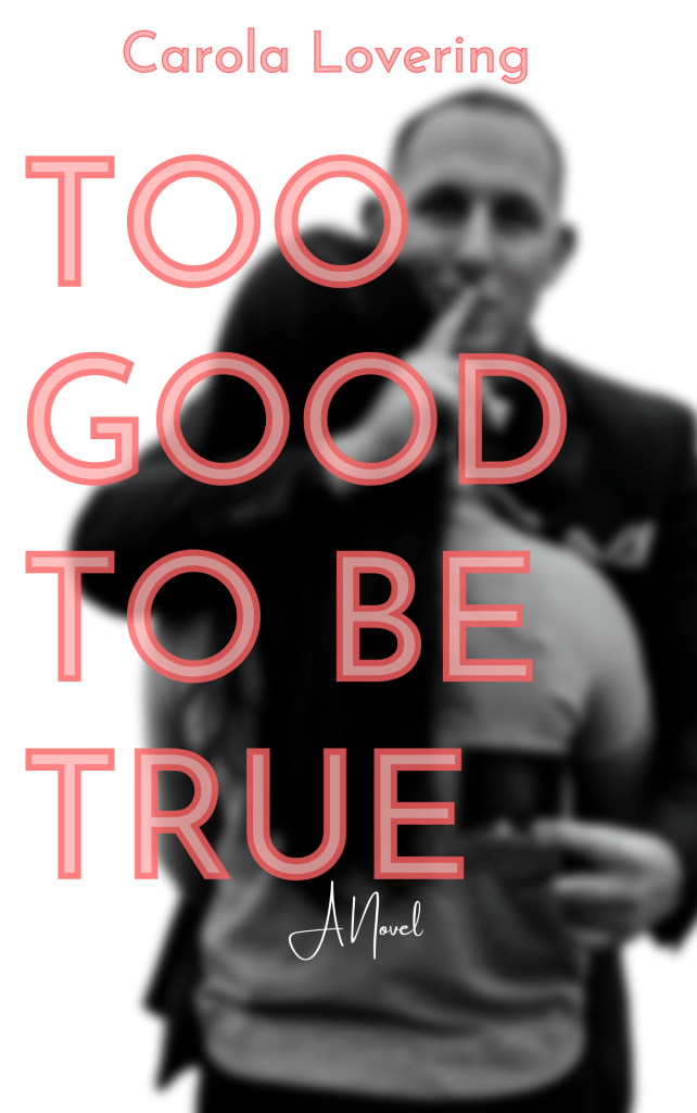
SOO I did another mostly black and white cover. Partially because I like black and white, mostly because I’m still learning how to use Canva/Illustrator/Photoshop and it’s easy to make something more dramatic by putting it in black and white.
The original cover isn’t terrible…. it’s just doesn’t give a glimpse into the story. I can see what they were going for. They wanted to convey that it was a story about marriage/proposals that was somehow going to go awry. But that could mean a lot of different things, it could be about a couple in their mid-forties who are going through a rough patch or it could be a sad book about a man who goes off to war and can’t return to his sweetheart, ya know? But, it’s a thriller-ish novel about a man who proposes to a woman and is not who he says he is. I though the SHHH-ing man along with the ring box along with the Too Good to Be True title told more of a story than the original. I also thought the addition of the pink gave it more of a pop than the other cover. I chose pink specifically because readers of the mystery thriller genre are majority women and that this particular thriller was definitely skewed towards female readers anyway.
